Positive Tweets
| DATE | USERNAME | TWEET |
|---|
Negative Tweets
| DATE | USERNAME | TWEET |
|---|
Compiled by David Born, Sam Ewing, Pranav Jayanth and Llorrvic Valles
| DATE | USERNAME | TWEET |
|---|
| DATE | USERNAME | TWEET |
|---|
This project utilizes Machine Learning to perform sentiment analysis on tweets relating to candidates of the 2020 Nevada Presidential Caucus. The tweets used in this analysis were collected at different times, in relation to critical events regarding the caucus and the Presidential race as a whole.
As we began our work, we found that sourcing data from Twitter proved to be a bit of a challenge. We hoped to utilize Twitter's official API, but after some investigation, we realized that Twitter's API only retrieves tweets from the last seven days. Because of this, we decided against using Twitter's API and started searching for other solutions.
We ultimately chose to use the GetOldTweets3 Python Library to retrieve our data, because of its search versatility and it's ability to retrieve tweets from any time period (although the library offers the ability to filter results by time).
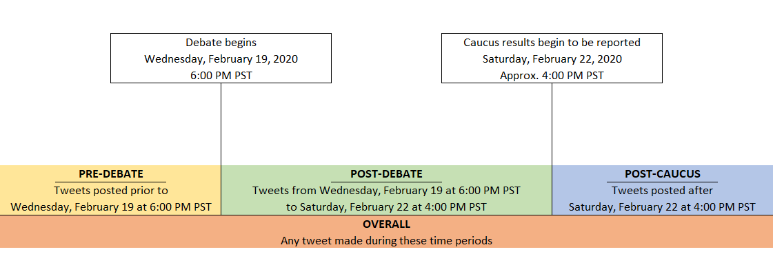
In order to gauge how sentiment changes over time, we performed multiple scraping actions before and after important events. We decided on four primary time periods to capture and analyze, including:
For this project, we decided to use Machine Learning concepts to analyze sentiment on Twitter. Our first challenge was to decide how to process the tweets. To accomplish this, we chose to use Natural Language Processing (NLP) in order to break down each tweet to analyze it.
We decided to use the Natural Language Tool-kit, or NLTK, which is purpose-built NLP library for Python. The cleanup process for a tweet before creating an ML model may best be explained by using some examples – imagine the following tweet:
The first thing we have to do is tokenize the tweet – this means that we break down the sentence into individual words:
The next step is to remove things like hashtags and other items like retweets and hyperlinks to only get the English words.
Finally, we create a bag of words where each instance of the word is given an equivalent weight. The concept behind bag of words is that we take each word, strip it of context (ie: it’s a grab-bag) and then we characterize/weight it.
After creating our bag of words, we can then create a testing / training data set. However, in order to create our training sample, we had to manually label each tweet as positive or negative (this involved reading individual tweets and categorizing them according to what we perceived the overall sentiment of the tweet was).
Finally, we used a Naïve Bayes classifier to classify the text as positive or negative, based on each word's Bag of Words values. We then ran the entire file with the predictor to get all of our results.
The tweet scraping method produced four separate Comma-Separated Value (.csv) files with overlapping time frames and, therefore, duplicated tweets. The cleaning deleted duplicate tweets from the same username, timestamp, and to (recipient). Tweets with blank text were deleted (less than 200 records). The timestamp column was re-formatted to: yyyy-mm-dd hh:mm:ss. The hours are in 24-hour time (AKA military time). Quote marks were removed, so as not to interfere with JavaScript coding controlling front-end display.
Over the sampled time frame (February 9-25, 2020), a frequency count by username was used to identify "tweeter types":
Suspected "bots" and "trolls" were further split out from the heavy tweeter group by manual inspection of their tweets.
After cleaning, the four source files containing tweet scrapes were manually combined into one Comma-Separated Value (.csv) file before loading into Postgres. The source file was loaded unchanged into a single Postgres table and then distinct records were inserted into a second table to ensure that there were no duplicates.
A series of process queries were then executed to stage the data for the API and dashboard reporting:
After staging, separate tables were populated by positive and negative tweet samples for final exporting for the API and Tableau dashboard. In addition, a summary table was created using a GROUP BY query that stored a count of candidate, sentiment, time period, date, and tweeter type. The summary table drives all the visuals on the Tableau dashboard except for the tweet samples.
Possible values for the summary table dimensions are:
With our data stored in a PostgreSQL Database, the next step was to develop an Application Program Interface (API) that could retrieve our data from the database for use on the front-end, as well as a platform to provide tools necessary to our website's functionality. To create this API, we utilized Python's Flask library.
The resulting Flask application drives two main APIs:
The Candidate API was created using data from our PostgreSQL database. It retrieves the data and then converts it into a JavaScript Object Notation (JSON) format using the Python Pandas library.
The Predictor API was created using a "pickled" (serialized) version of the initial Machine Learning model. When provided an input, the API will load the model and pass the input string into it. After performing it's analysis, the model will output a series of probability values about the sentiment of the input string. These values are returned to the website for display.
The Python Flask app that creates our API is hosted using Heroku. Because Heroku has a 10,000 record limit for data, we utilize a set of random numbers to select manageable increments of our data. For more information about how this selection process occurs, please refer to the previous section (Part 4 - PostgreSQL Database).
As the webpage loads, a call is made to the API that was built in the previous step. Once the data is retrieved from the API, it is organized into a format that can easily be applied to the various dynamic website elements.
The d3.js JavaScript library is utilized to select labeled tags throughout the website. These selections are used as containers for our data to be dropped into. When the website is updated (either through initialization when the site is first loaded, or when a new selection is made from either of the two drop-down menus), each of these selections are called and perform the following actions:
This process is applied to every piece of dynamic content on the webpage - none of the elements pertaining to displaying our data is permanently-coded into our site.
The visuals displayed on this webpage are created using a Tableau dashboard that is embedded into the page. Typically associated with Business Intelligence (BI), Tableau is a powerful visualization tool that enables the creation of complex, fully-interactive visualizations in a user-friendly manner. The only JavaScript being utilized on this page controls the dimensions of the dashboard on the page.
Users can gain deeper insights into the data by clicking on each chart (particularly the bubble chart and the stacked-bar chart, which display sentiment values over time and a set of tweets respectively). A drop-down on the Tableau dashboard also allows users to filter content on time-point, similar to the Dashboard page.
The Predictor page allows users to test our model for themselves. The page features an input form where users can either copy a tweet they see on Twitter, or write their own "tweet" mockup. Upon submitting the value of this form, the website calls our API requesting data for the input value. The API call activates our model, which analyzes the value entered into this field. When the model completes it's analysis, it returns a sentiment prediction of whether the "tweet" is a positive or negative one. A table displaying the sentiment of the most heavily-weighted words discovered by our model is also dynamically generated, along with a line graph that shows how the sentiment value of these words compares to one another.
Like the Dashboard page, the page is designed to be dynamically populated with data upon receiving a new input using the d3.js JavaScript library. In regards to how the data is displayed, there are no hard-coded elements on this page.