Migrant Deaths in the Southwest United States
Compiled by David Born, Sam Ewing and Pranav Jayanth
VISUALIZATIONS
Port
ABOUT THIS PROJECT
Project Summary
The goal of this project is to examine migrant deaths in relation to border crossing traffic along the US-Mexico border. Through visualizing the data recorded by the Missing Migrant Project and the Bureau of Transportation Statistics, we aim to provide a means of visual analysis of migration patterns and missing migrants at different points-of-entry along the southern border.
Data Transformation and Methodology
Both datasets are retrieved from Kaggle (see right for more information) and are loaded into Python for processing. The Pandas library is used to load the .csv files into dataframes for refinement. Null-values and missing datapoints are dropped (when determined to be appropriate) and data is organized and adapted to easier use in SQL. The Haversine library is used to identify the nearest port of entry to each incident ("as the crow flies") and saved for plotting purposes. Once the datasets are refined, they are broken down into smaller datasets that can be joined or merged in a SQL database. These smaller datasets are output by Pandas as .csv files for loading into PostgreSQL.
Each of the .csv outputs created by the Python script are imported into a Third Normal Form (3NF) PostgreSQL database using PGAdmin4 for storage and queries. Each .csv is loaded into its own table in PGAdmin4, so that it can be queried individually or joined with the other tables.
Once the data is placed into SQL, a new set of de-normalized tables are created in preparation for API use. This involves grouping data for summary tables, deriving additional column variables, and populating new columns mapped to 3NF codes with corresponding descriptive values. These de-normalized summary tables are then referenced by the Python Flask application detailed in section 3.
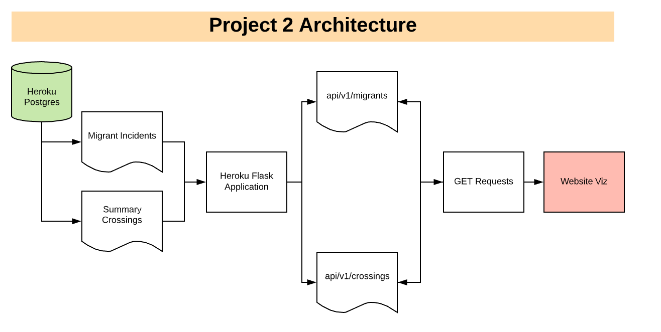
In order to make sure our data is accessible through the web, we created an application that hosts data APIs for our front-end visualizations to consume.
To create our API, we had to use Python in order to query the PostgreSQL database created in the previous step. We used an Object-Relational Mapper (ORM) called psycopg2 in order to do this.
To stage our Postgres data, we created 2 denormalized tables that joined essential information about ports and migrant incidents (refer to section 2 for more information).
After we created these tables on a local database, we used Heroku to host the database online. In order for Heroku to interface with our database correctly, we used the Heroku Postgres add-on during the creation of our Heroku server. The end result of this process is a production database that can drive the data for our Flask application.
In order to create an application to generate our API, we used Flask to create our app and our routes (similar to a website directory). Our app has two routes - one containing Missing Migrant data and another containing Border Crossing data.
Our ORM query was simple - there were no filters applied or other manipuluations done using Python after the tables were hosted on Heroku Postgres.
At this point, the challenge was to get the tables from Postgres (that was in a tabular format) to be delivered in a JSON format for our API. After the JSON was returned for our migrant incident and port tables, our APIs were ready to be consumed.
Finally, we hosted this Flask application on Heroku as an app. We did this so our APIs were hosted on the internet and could be easily called by any front-end. This data is ultimately used to generate the charts and maps on our site.
Hosting the app on Heroku required a full deployment, along with the installation of necessary resources on the server side.
An API Call is made to the API created in the previous step, and the data retrieved is used throughout our website to build our interactive visualizations.
Our maps were created using the Leaflet.js JavaScript library. Map setup included specifying a set of map layers that can be toggled by the user (including a Street Map view and a Satellite view). Once the base map is built, Leaflet is used to plot individual markers that correspond to a missing migrant incident or a border port.
In order to ensure our maps display correctly within our webpages, our Maps are created in their own .html documents and embedded into the website. An added benefit of this approach is that the full map can be viewed independently on it's own webpage by clicking the link at the bottom of the map on each page.
Plotting the Missing Migrant Incidents
When data is retrieved from the Migrants branch of our API, a set of map layers are defined to match each year within our data. The data is then sorted by the year reported and stored. As the data is assigned to it's respective year layer, a counter is incremented in order to count the number of incidents in each year. These counts are then reported in the display in the bottom-left corner of our Dashboard map.
Once sorted, a marker is created for each incident. An HTML template is added to each marker, containing both hard-coded HTML text (example: "Total Fatalities: ") and values dynamically populated from the data record (example: 3) for each line.
The process for creating the map on our Southern Border Map page followed a similar format, however, instead of assigning data to a set of layers based on year, we chose to organize the migrant incidents data using marker clusters, in order to easily visualize the volume of migrant incidents in a given region along the US-Mexico border. This map is intended to show all of our data at once, to give a "big picture" perspective to our data, while the map on our dashboard is intended to visualize data in different ways to analyze incidents by year.
Plotting the Border Crossing Locations
When data is retrieved from the Border branch of our API, the data is initially sorted by port code (example: 2301) in order to collect all the data associated with each port, regardless of year.
Once sorted, the data-packet is unpacked and sorted, storing the yearly data for each metric, which is then summed to gain a total for that metric. Once all the metric totals are compiled, a circle marker is created for each border port. An HTML template is added to each circle marker, containing both hard-coded HTML text (example: "Total Number of Trucks: ") and values dynamically populated from the data record (example: 365882) for each line.
API calls are made to the heroku host and the data retrieved is used throughout our website to build charts and create interactive maps. We used two libraries to produce the charts. The charts on the home page (above) were created using Plotly. The charts on the "Southern Border Map" page were generated using chartjs. Each collection of charts is described as follows.
Plotly - Charts on the Dashboard
There are two Plotly charts displaying: year-by-year trends for (1) migrant casualties (bar chart) and (2) pedestrian crossings (line chart). The charts compliment the Leaflet map view on the home page which enables the user to examine migrant incident volume and location by year. Each chart updates interactively to show information for specific ports of entry as selected from the drop down menu.
Chartjs - Charts on the Southern Border Map Page
There are three charts created using Chartjs displaying: (1) migrant fatalities/incidents relative to different port and their respective pedestrian crossing volume (bubble chart), (2) migrant fatalities trend by year and sex (stacked line chart), and (3) cause-of-death (pie chart). All the charts are intended to compliment the Leaflet map on the same page which allows the user to explore areas around the ports to assess the volume of migrant incidents. The bubble chart is static, but provides a high-level perspective to see which ports are located in areas that appear to be more (or less) dangerous to migrants. The stacked line and pie charts refresh interactively with the port selected in the drop down menu, thereby enabling the user to drill down into the trends.
Data Sources
In order to perform this analysis, we used two separate datasets retrieved from kaggle.com. We also introduced a third dataset from humaneborders.info to enhance our original datasets.
MISSING MIGRANTS PROJECT
The Missing Migrants Project records the deaths and disappearances of migrants around the world. According to the project's Kaggle page, the project's research began in October of 2013, following two shipwrecks near the island of Lampedusa which claimed at least 368 lives.
Kaggle Source: Missing Migrants Project (.csv)
Original Data Source*: IOM's Missing Migrants Project
Attribution
* The Missing Migrants Project dataset is property of the Missing Migrants Project, with downloads of their data licensed under a Creative Commons Attribution 4.0 International License. This type of license indicates the free use of the licensed material as long as proper attribution is given to the asset's original owner. Per the request of the original owner, a link to the original data source has been included above.
Note: In order to fit our needs, the original dataset has been modified. Our modifications include cleansing the original dataset and updating certain records with data from local law enforcement sources (see the humaneborders.info section below).
BUREAU OF TRANSPORTATION STATISTICS BORDER CROSSING DATA
This dataset is a compilation of summary statistics for inbound crossings at the port level for both the Canadian and Mexican borders. This summary data is based upon data collected at each border port by U.S. Customs and Border Protection. Statistics are included for pedestrians, personal vehicles, passengers, buses, trucks, containers and trains entering the United States.
Source: Border Crossing Entry Data (.csv)
HUMANEBORDERS.INFO
As we began plotting each incident from the Missing Migrants Project data, we encountered anomalies in the way the data was plotted (hundreds of incidents shared the same coordinates). Upon further inspection of the affected points, we realized that the data containing these incidents contained placeholder coordinates that masked the true locations of these incidents.
To fix the problem, we sourced data from the humaneborders.info website and matched to the Missing Migrants Project data incidents on incident date, fatality count and cause of death, allowing us to examine these incidents with their original coordinates.
Source: HumaneBorders.info Custom Map of Migrant Mortality (.csv)